As we have seen in the last post, Plotly does not always use colours with a high enough contrast. In this post we explore the different options we have to choose better colours.
This post is part of my journey to learn Python. You find the code for this post in my PythonFriday repository on GitHub.
CSS colours
Plotly as a JavaScript library uses CSS colours throughout its styling options. We can find the whole list of pre-defined CSS colours in the Mozilla Developer documentation. We not only get the names of the different colours, but also an example on how this colour looks.
Using custom colours
As a reminder, the default colours for the pie chart look not that great:
|
1 2 3 4 5 6 7 8 9 |
import pandas as pd import plotly.express as px tips = px.data.tips() fig = px.pie(tips, values='tip', names='day') fig.show() |

We can use our own set of CSS colours and use them as color_discrete_sequence parameter:
|
1 2 3 4 5 6 |
custom = ["chartreuse", "darksalmon", "darkcyan", "darkkhaki"] fig = px.pie(tips, values='tip', names='day', color_discrete_sequence=custom) fig.show() |

We can also use the HEX values for our colours to match the style of our corporate identity:
|
1 2 3 4 5 6 |
custom = ["#ffaf3c", "#3c5587", "#adb7c4", "#ad8a57"] fig = px.pie(tips, values='tip', names='day', color_discrete_sequence=custom) fig.show() |

Map specific values to a colour
If we have multiple plots and we want to show the same data with the same colour, we can use color_discrete_map and use a dictionary to map a category to a colour:
|
1 2 3 4 5 6 7 8 9 10 |
fig = px.box(tips, x="time", y="total_bill", color="day", color_discrete_map={ "Sun": "red", "Sat": "green", "Thur": "blue", "Fri": "magenta"},) fig.show() |

Discrete colours for categorical values
Plotly offers us a wide range of built-in colour sequences that we can use without first defining the specific colours. We can get the list of possible sequences with this code:
|
1 2 |
fig = px.colors.qualitative.swatches() fig.show() |

We can use the names of those sequences in our plots with the color_discrete_sequence parameter:
|
1 2 3 4 5 |
fig = px.pie(tips, values='tip', names='day', color_discrete_sequence=px.colors.qualitative.Vivid) fig.show() |

We can reverse the colour selection by adding a _r at the end of the sequence name:
|
1 2 3 4 5 |
fig = px.pie(tips, values='tip', names='day', color_discrete_sequence=px.colors.qualitative.Vivid_r) fig.show() |

Continuous colours for numerical values
For numerical values we need a more continuous sequence of colours. We can explore what Plotly can offer us with this command:
|
1 2 |
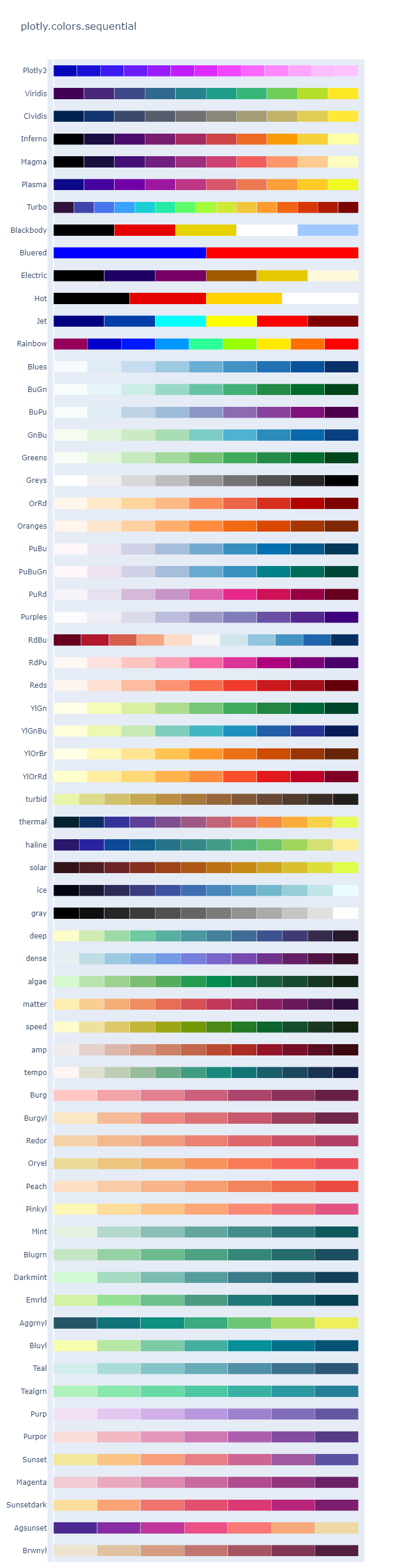
fig = px.colors.sequential.swatches_continuous() fig.show() |
We can use these continuous colours with the color_continuous_scale parameter:
|
1 2 3 4 5 6 7 |
fig = px.scatter(tips, x="total_bill", y="tip", color="tip", color_continuous_scale=px.colors.sequential.Agsunset_r) fig.show() |

Should we use these continuous colours for categorical values, Plotly will split the colour scale up for us:
|
1 2 |
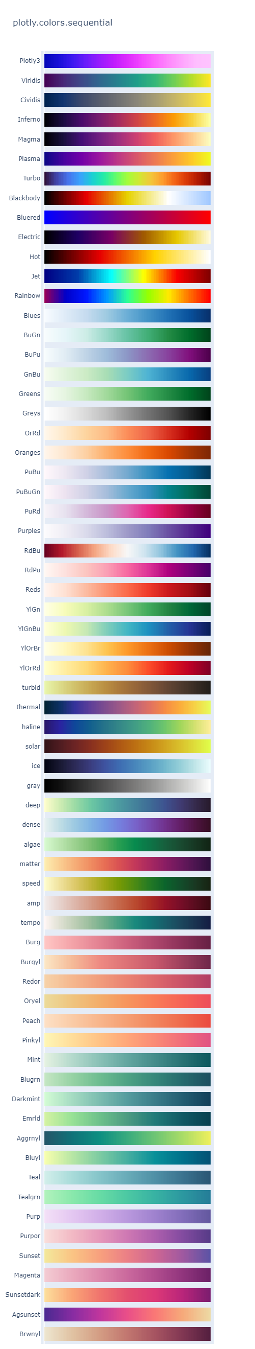
fig = px.colors.sequential.swatches() fig.show() |
We can use one of those continuous colours for our categorical values:
|
1 2 3 4 5 |
fig = px.pie(tips, values='tip', names='day', color_discrete_sequence=px.colors.sequential.Agsunset_r) fig.show() |

Diverging colours
If we want a colour that shows the difference from a middle value, we can use any of the diverging sets:
|
1 2 |
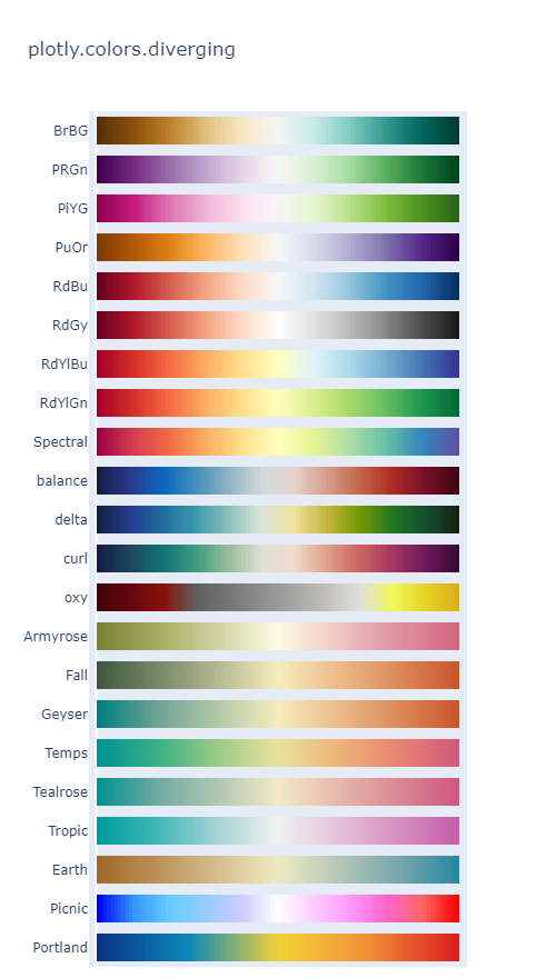
fig = px.colors.diverging.swatches_continuous() fig.show() |
We can apply those diverging colours in our plots:
|
1 2 3 4 5 6 7 |
fig = px.scatter(tips, x="total_bill", y="tip", color="tip", color_continuous_scale=px.colors.diverging.Portland) fig.show() |

Repeating colours
If we need a colour combination that is cyclical, we can use one of those colours with Plotly:
|
1 2 3 4 5 |
fig = px.colors.cyclical.swatches_cyclical() fig.show() fig = px.colors.cyclical.swatches_continuous() fig.show() |


Next
Getting the colours right is an important part of a nice visualisation. However, there is more to styling than the colours and we explore those options next week.
3 thoughts on “Python Friday #193: Choosing Colours for Plotly”